Corporate Design, Stationery and Website for the Dentist »Dr. Willerding« [Tegernsee]
PROJECT
CORPORATE DESIGN, WEB DESIGN AND ICONS
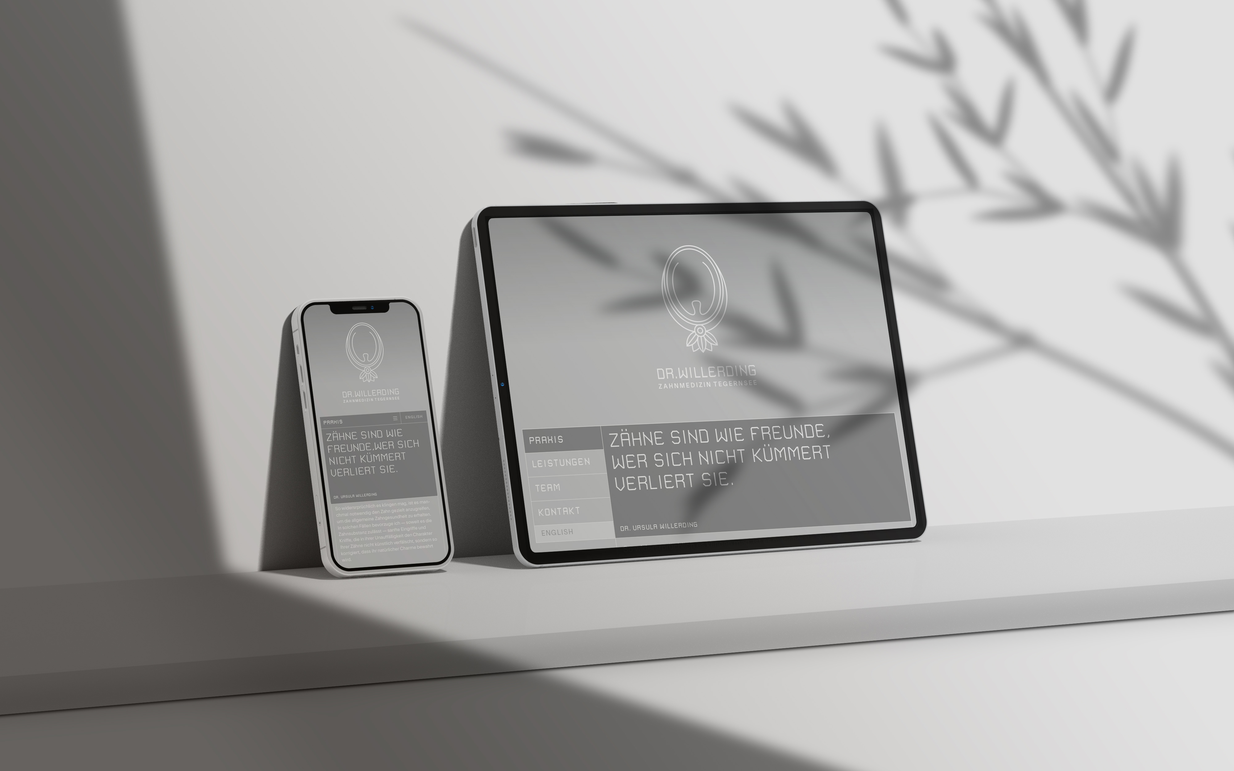
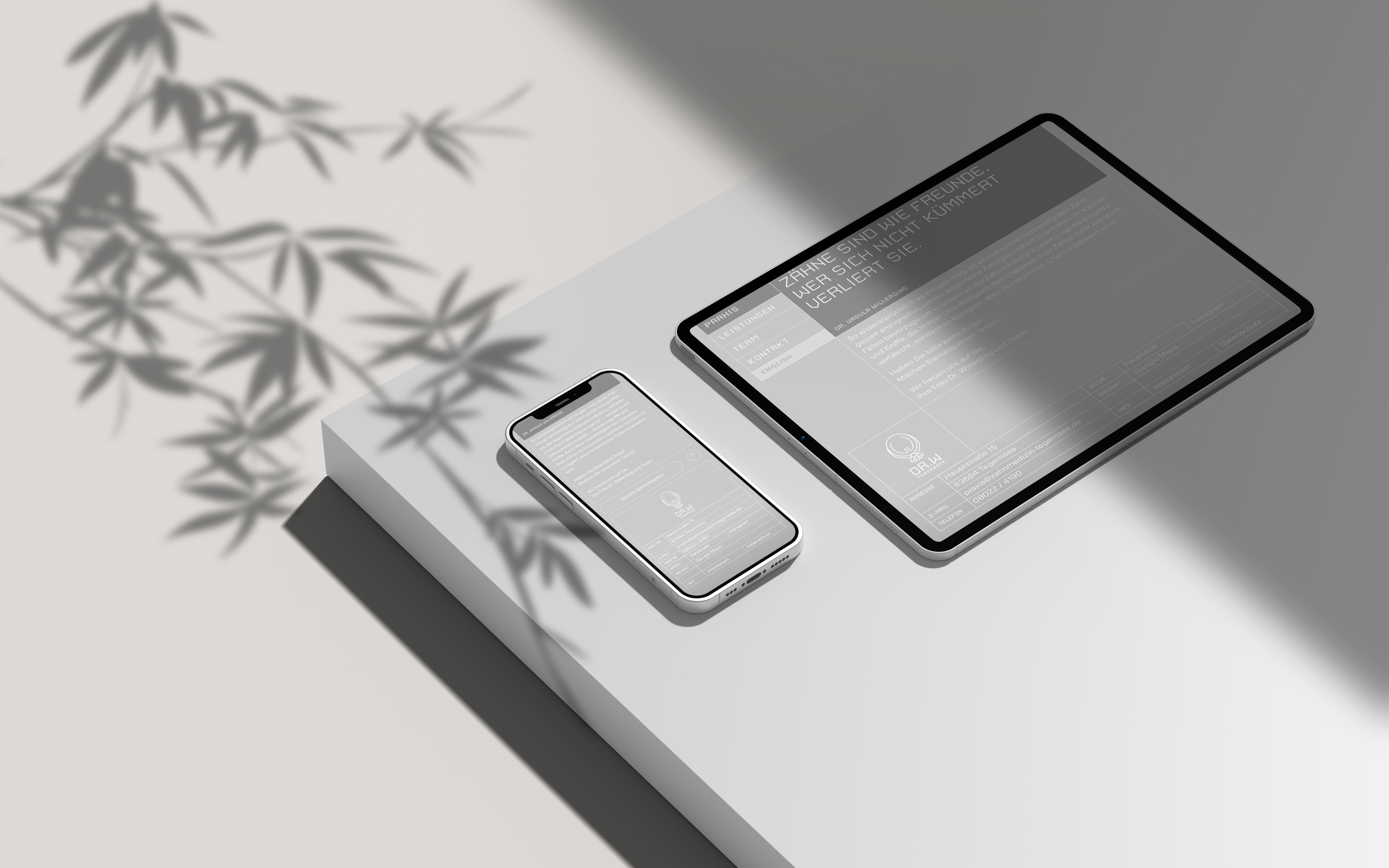
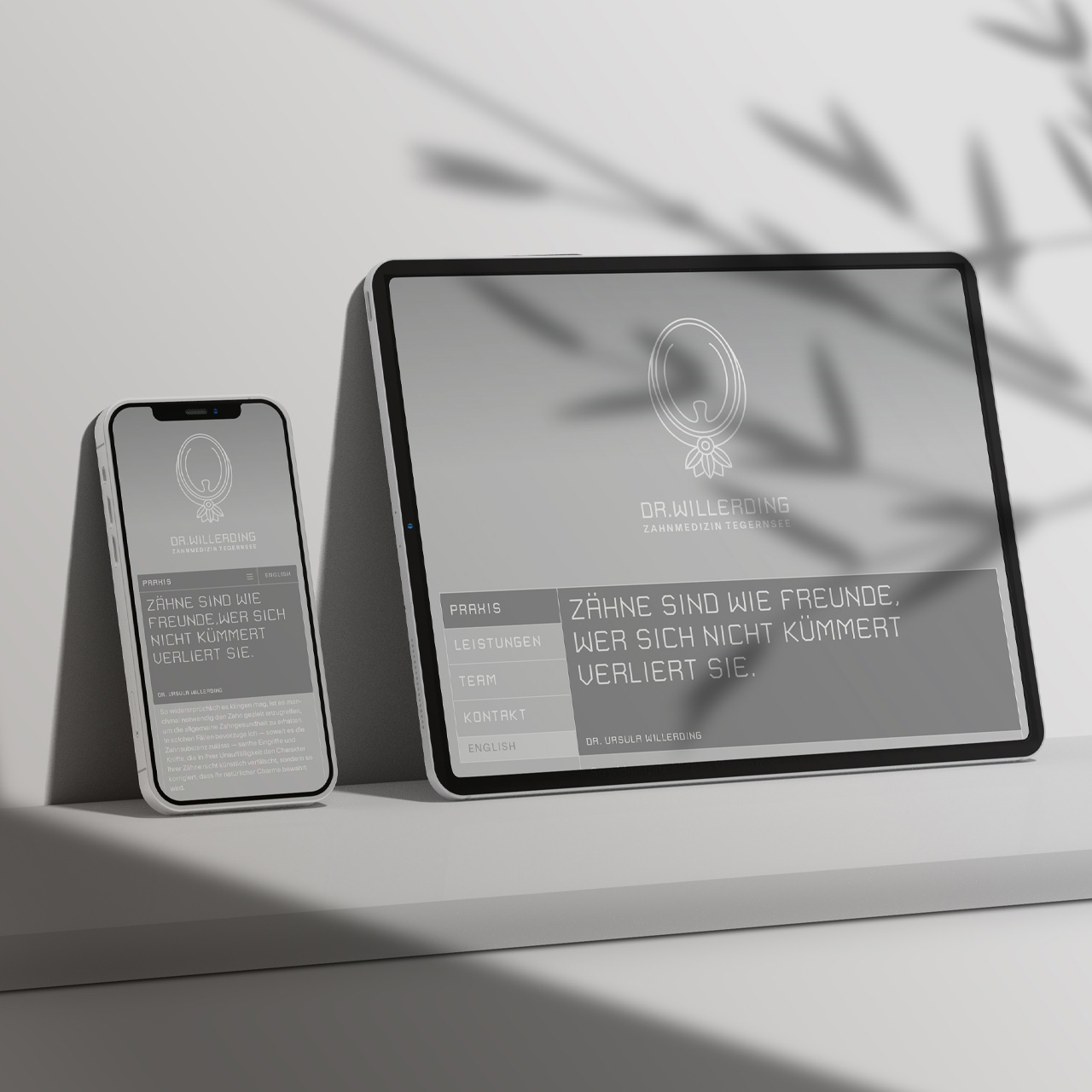
»Teeth are like friends. If you don’t take care of them, you’ll lose them.« With this tagline, the new dental practice of Dr. Willerding at Tegernsee is introduced. During the founding phase, I was responsible for developing the positioning and corporate design.
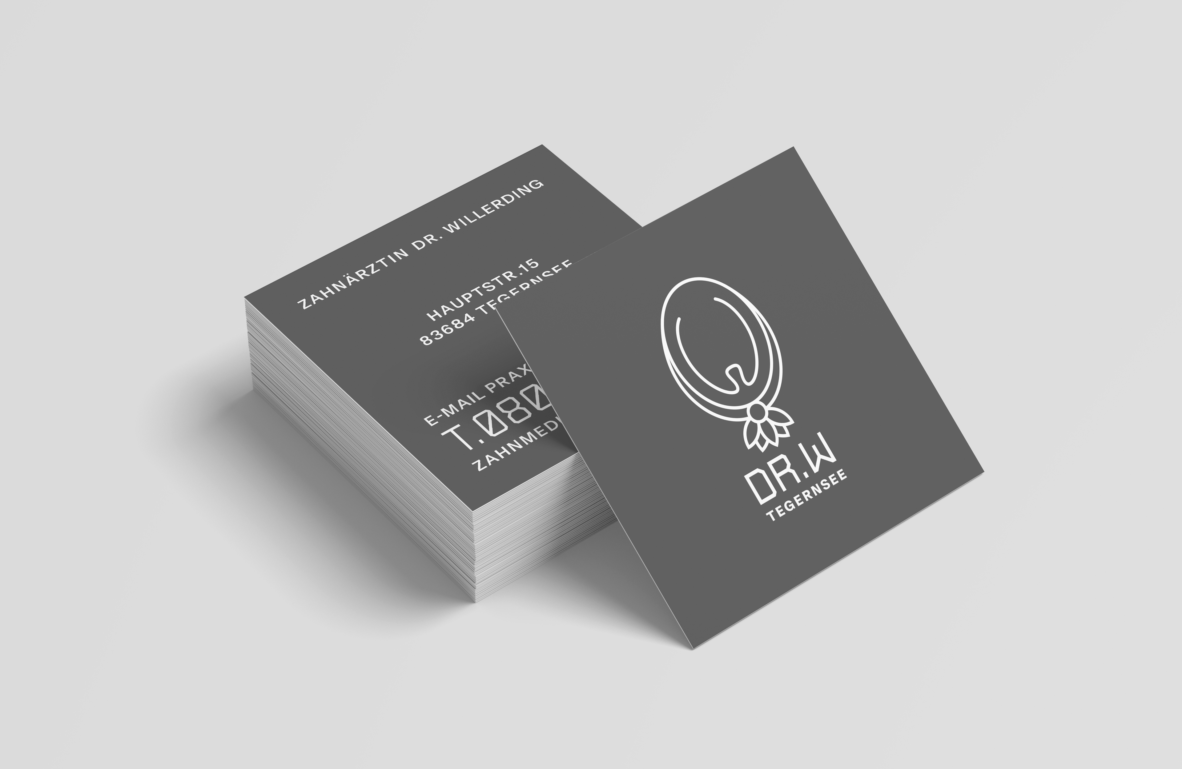
The brief included creating a classic-modern design along with business cards, flyers and a website. The explicit request was to avoid using a tooth as a motif for the logo, as »everyone does that.« However, the final logo does feature a tooth, framed like a brooch – and there’s a good reason for that.
Since many patients associate dental visits more with fear than joy, it was important to develop a graphic and verbal language that conveys the reassuring feeling: »Here, I’m in good hands.« The key lies in using approachable language free of jargon and a healthy dose of humor. These elements balance the rigidity of the design with softness and charm. Clarity doesn’t have to be cold and distant; it can also foster trust and safety.
MAKING OF
The project began with discussions about the character of the new dental practice. Questions included: »Why do you want to start your own practice?«, »What do you want to do differently as a boss compared to your previous employers, and what would you continue to do the same?«, »What aspects of employee relations are important to you?« and »Why is it important to you to provide the best possible care for your patients?«
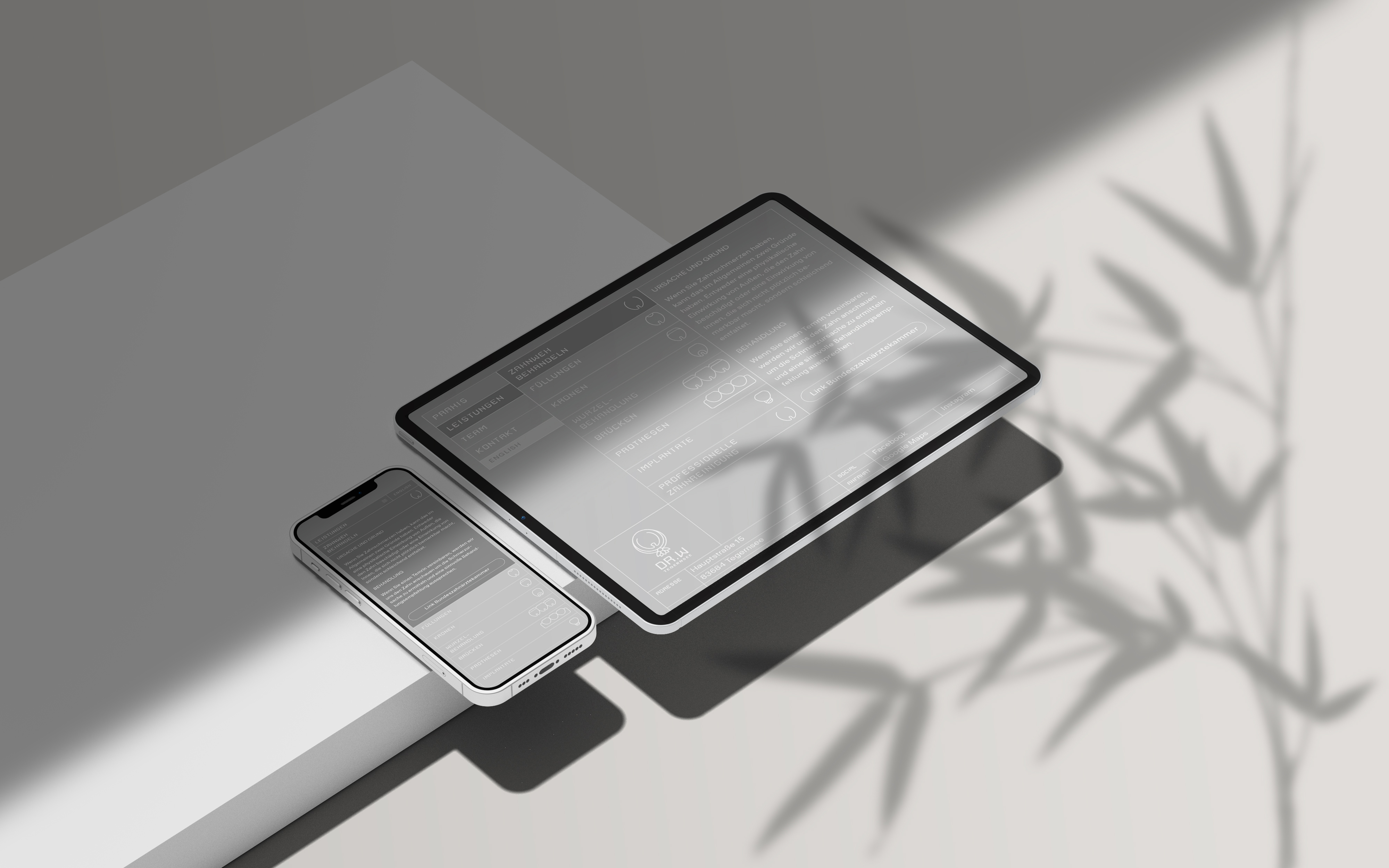
The tooth is surrounded by an oval, which at the bottom is adorned with stylized peony leaves (Dr. Willerding’s favorite flower). For some, this may evoke the association of a candy, subtly referencing sugar as the arch-enemy of every dentist. To emphasize the central role of the logo in the corporate design, the basic shape of the tooth was used to develop a series of icons representing various services on the website.
The logo is available in both a large version, used on the website and for signage and a smaller version. For readability, the small logo omits the full name in favor of the much shorter abbreviation, »DR. W.«
LINK WEBSITE
CREDITS
. Code: Lukas Luftläufer
SERVICES
. Corporate Identity
. Corporate Design
. Logo und Claim
. Icon Design
. Web Design
. Text
. Beschilderung
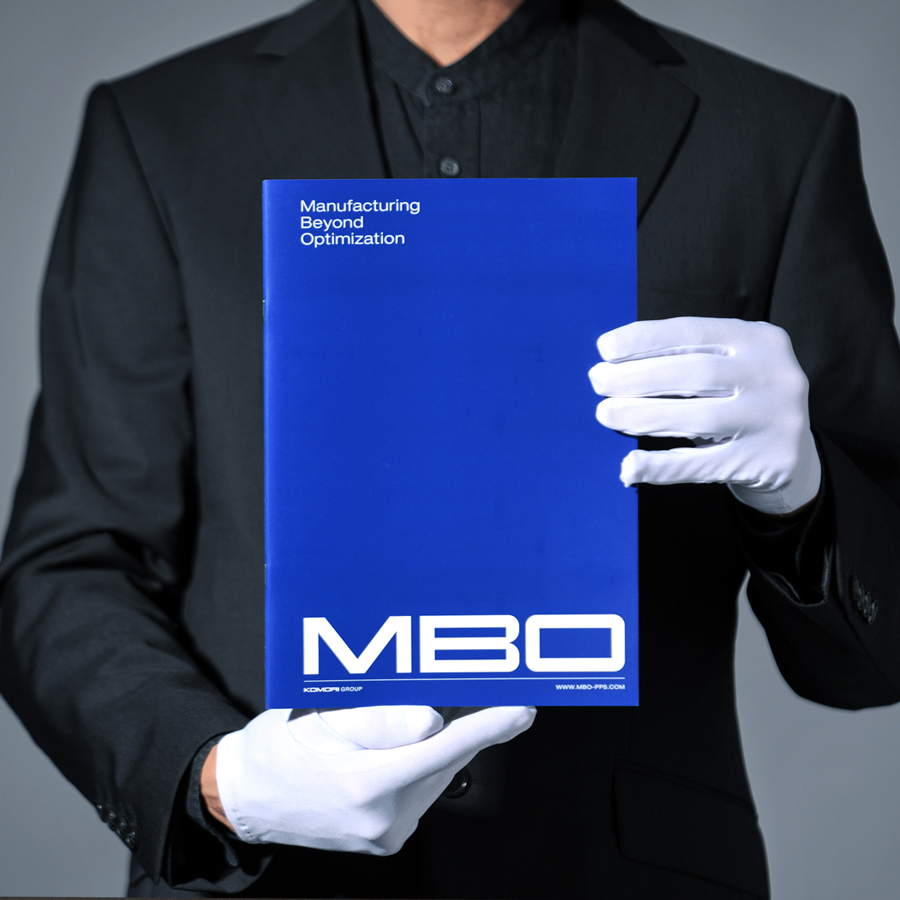
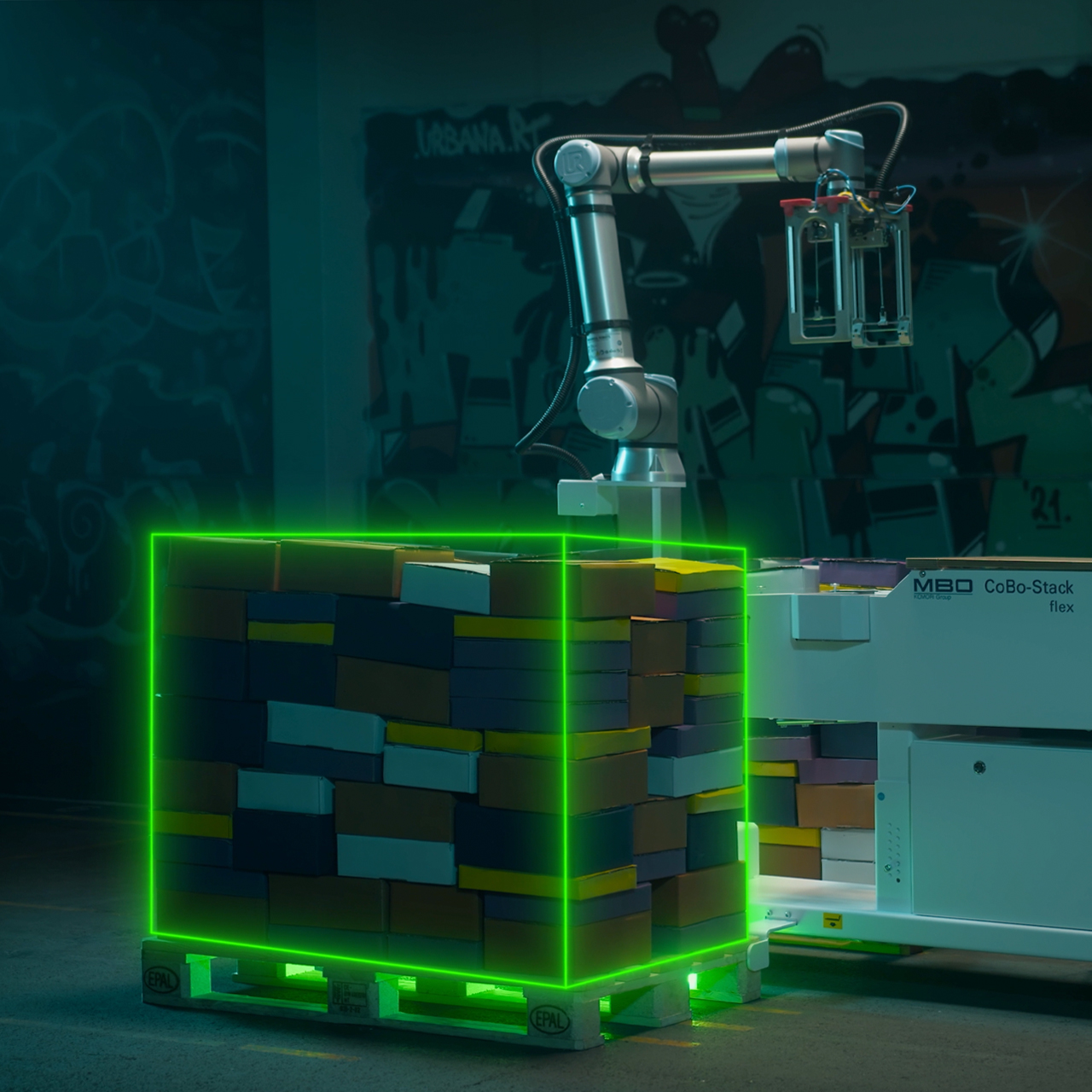
Creative Direction, Storyboard and Video Editing for the Product Video »CoBo Stack by MBO« [Komori Group]
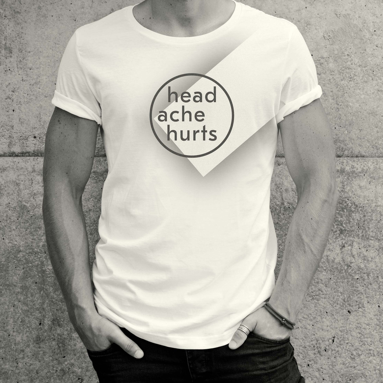
Campaign »Headache Hurts« for headache prevention [ZIES powered by Barmer]
BLOG
ARTIKEL, PROJEKTE UND VIDEOS
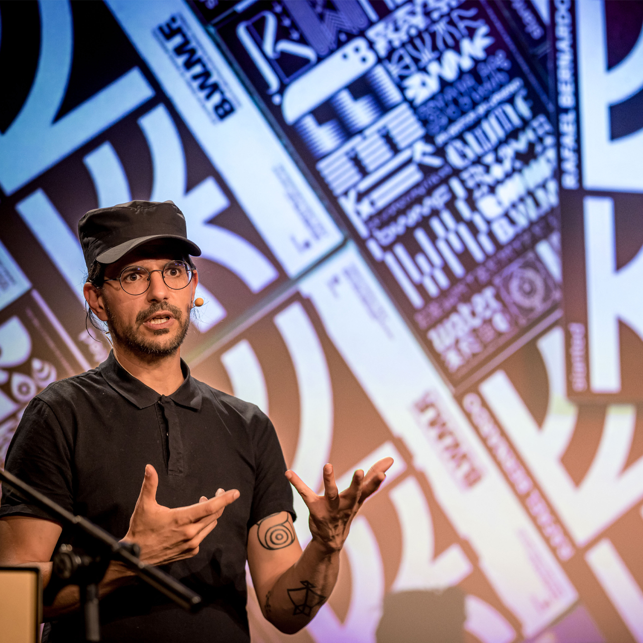
How I developed a methodology to bring creativity into the flow [»Be Water my Friend«]
Article Rafael Bernardo — »Be Water my Friend« Creative Methodology EN
Roundtable with Magdalena Schmid on her project »No One Wins Tonight« [a book about the death penalty]
Roundtable with Sven Saro on his project »Ohne den Hype« [a podcast with and for creatives]
Corporate Design, Stationery, and Website for the Dentist »Dr. Willerding« [Tegernsee]
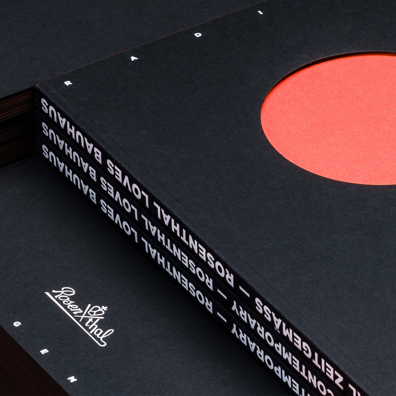
Magazine »Radikal Zeitgemäß« for the porcelain manufacturer Rosenthal [100th Bauhaus Anniversary]
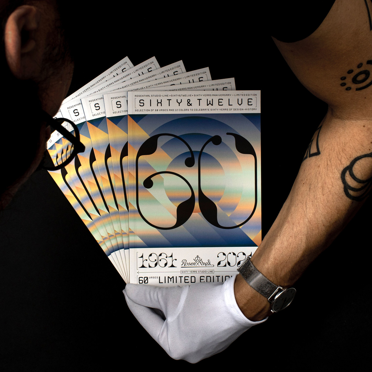
Campaign »Sixty & Twelve« for the Porcelain Manufacturer Rosenthal [60th Anniversary of Rosenthal]
Creative Direction, Storyboard and Video Editing for the Product Video »CoBo Stack by MBO« [Komori Group]
Roundtable with Daniel Rödel — Creativity between profession and vocation [From Bavaria to Peru]
Roundtable with Lars Harmsen on his project »REVISION« [a retrospective on a past full of projects]
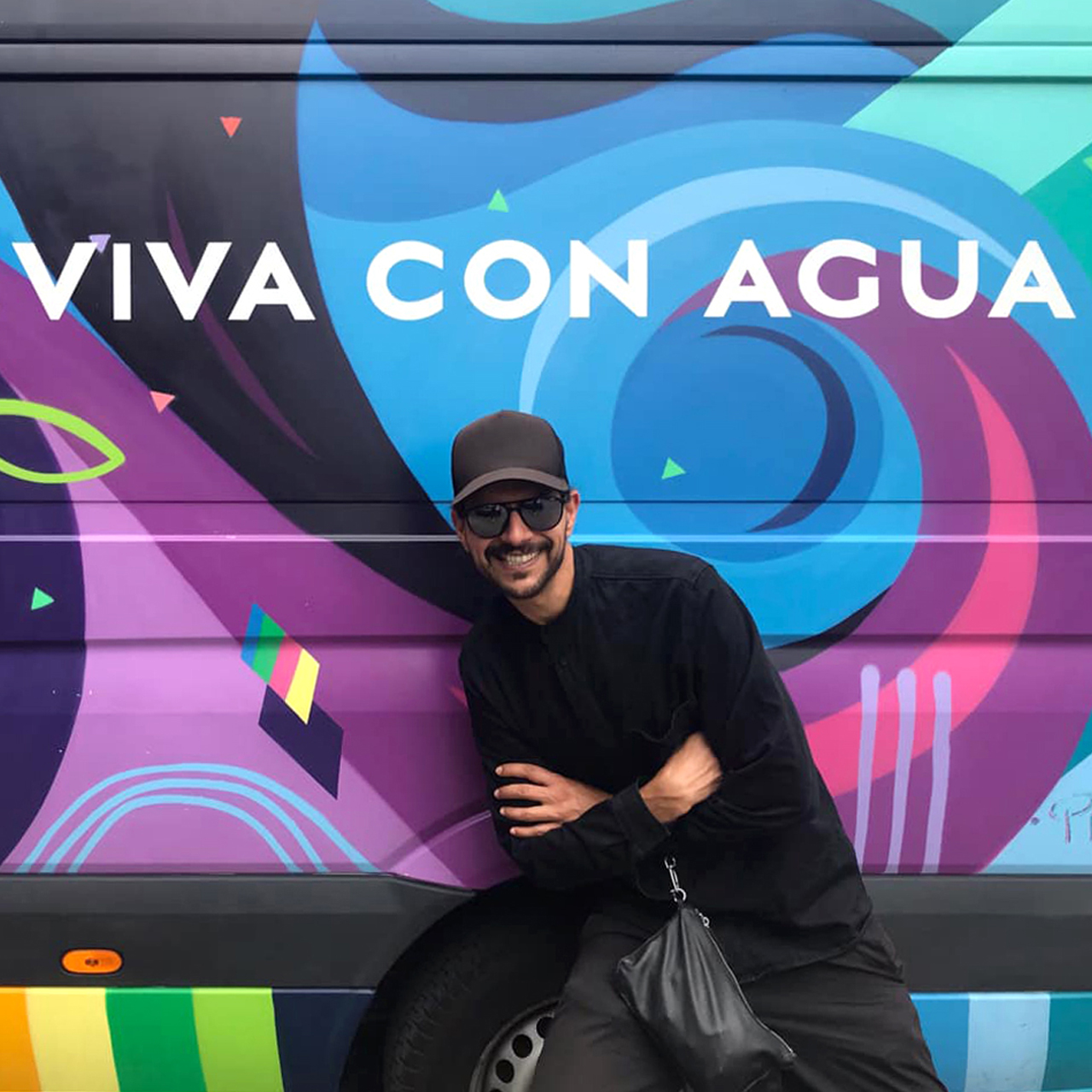
Support for the Nonprofit Organization Viva con Agua St. Pauli [Hamburg, Stuttgart, Munich]
Campaign »Headache Hurts« for headache prevention [ZIES powered by Barmer]
Minimalism and Graphic Design for »Domestika« [an online course]
Program Book »Connect & Disconnect« for the Typographic Society Munich [Voluntary Engagement]
Roundtable with Boris Schmelter on his project »Schmelter Brand Design« [from studio to agency]
Roundtable with CELLZ on his project »When I‘m Back« [a song about love that is interrupted by duty]
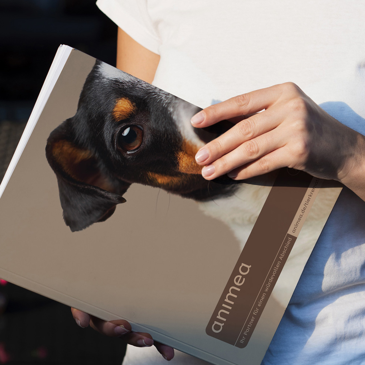
Corporate Design, Icons and Interface Design for »Animea — Pet Cremation« [Mars Incorporated]
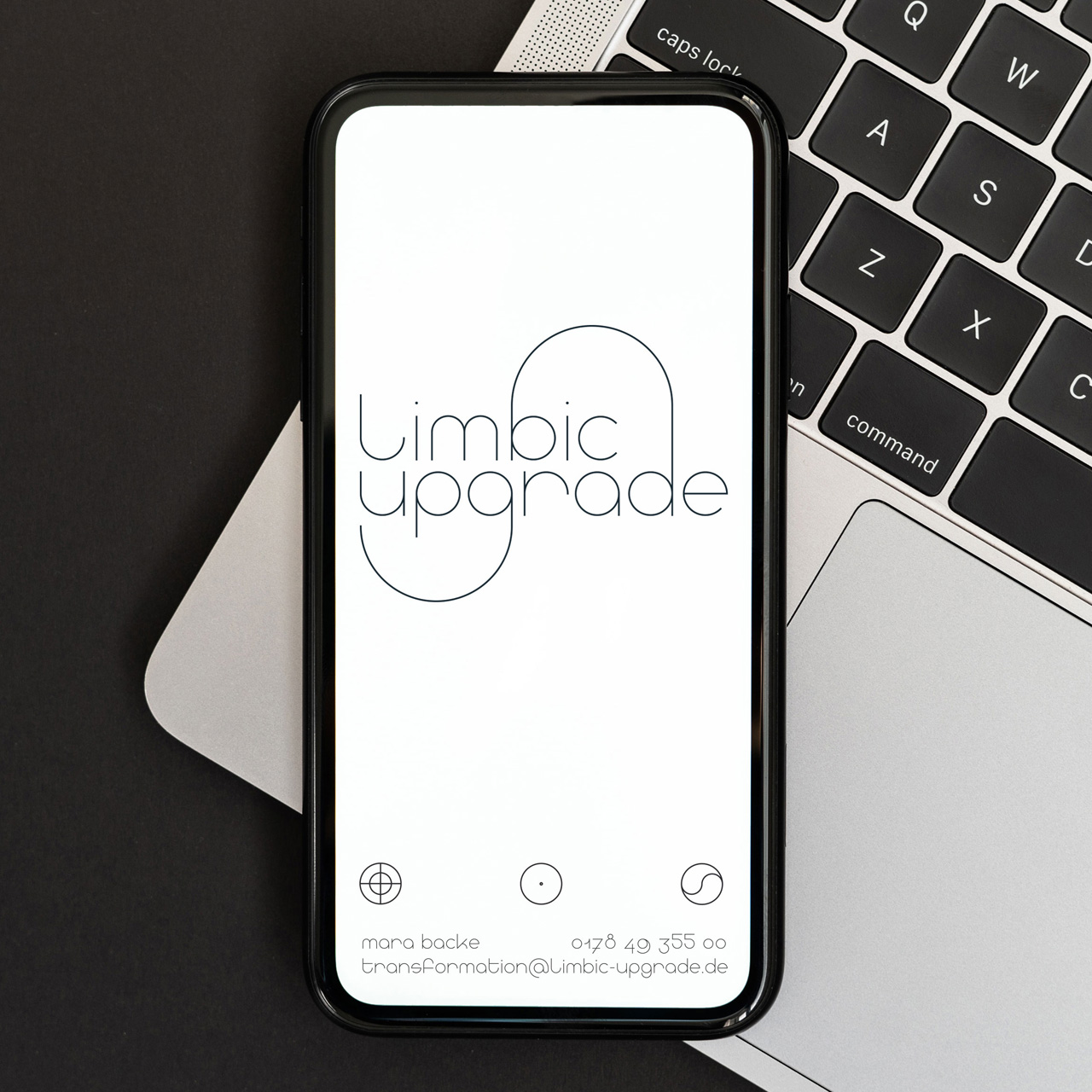
Corporate Design, Typeface Development and Web Design for »Limbic Upgrade« [Mental Health]
How I rediscovered myself through a personal design project [»Be Water my Friend«]
Article Rafael Bernardo — »Be Water my Friend« Graphic Journey EN
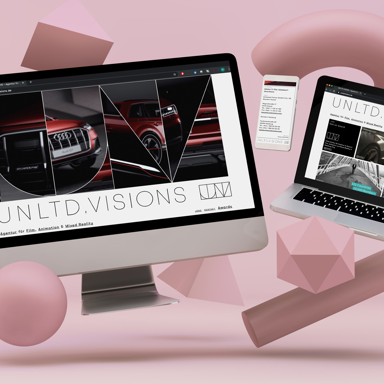
Corporate Design and Website for the Animation Studio »Unlimited Visions« [Hamburg – Kassel]
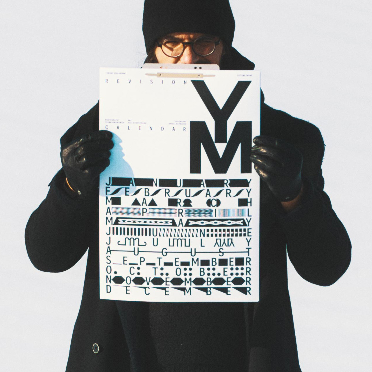
Typographic calendar »REVISION« for DJ and Photographer Axel Gundermann [Yearroundmunich]
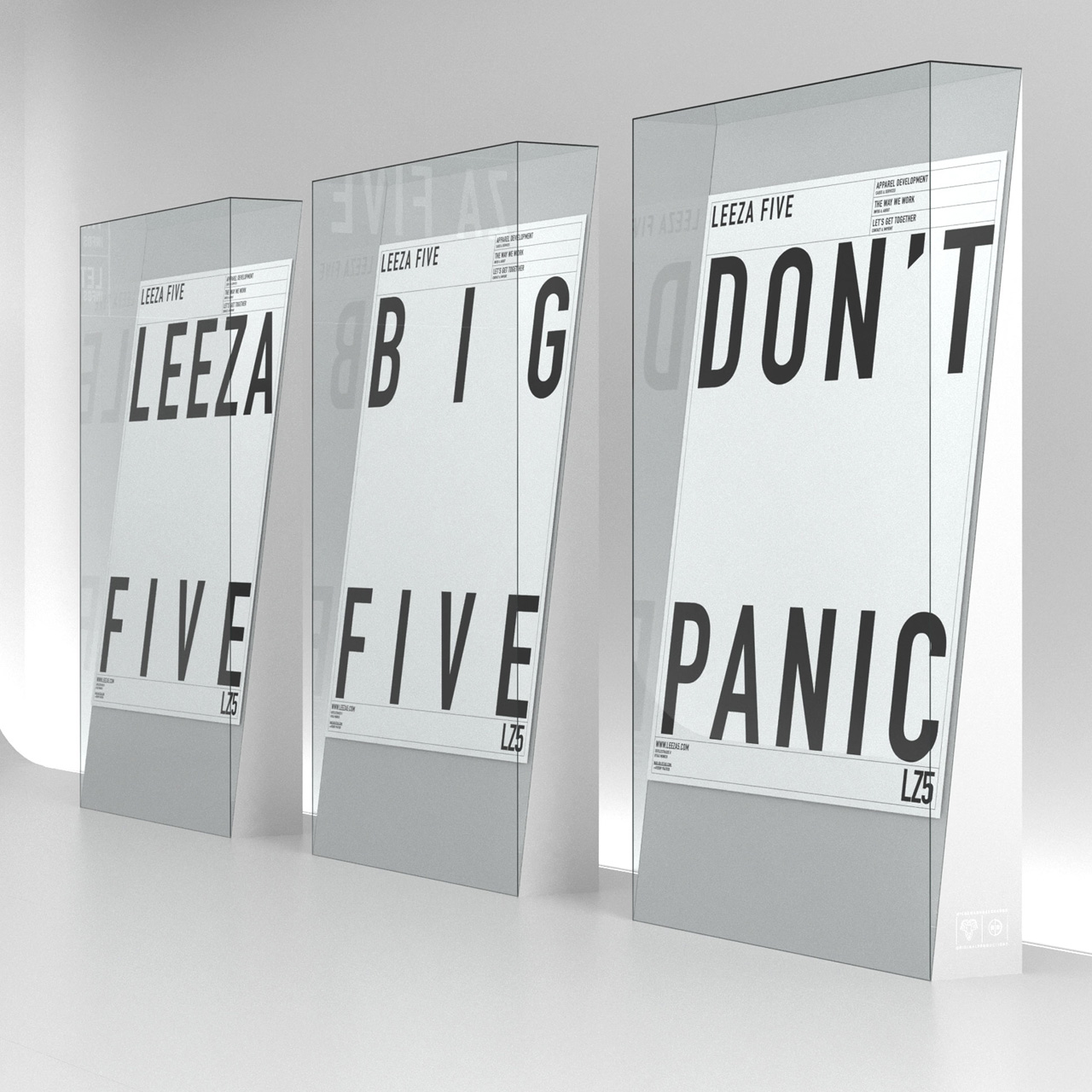
Web and Shop Design for Fashion Design Studio »LEEZA FIVE« [From Zero to Garment]
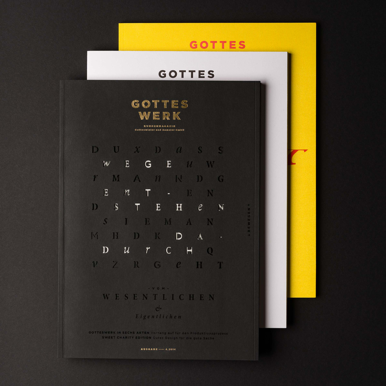
Magazine »GOTTESWERK I–III« for Munich’s oldest printing house [Gotteswinter & Aumaier]
Lecturer in Typography at the Hochschule für Gestaltung Schwäbisch Gmünd [Lecturing Post]